.svg)

1911 N Fort Myer Drive, Suite 1100
Arlington, VA 22209
866-568-0590
info@clearpointstrategy.com
Every city has the meeting. A council member asks how the downtown parking objective is doing. The honest answer is that the last update was in March.
 Bartlett, TN
  Durham, NC
  Virginia Beach, VA
  Fort Collins, CO
  Coral Springs, FL
  Germantown, TN
Three numbers from 161 cities and counties running their plans on ClearPoint.
Your shortlist all have dashboards. By the time you compare them, the grids look identical. The question that decides this purchase is narrower: will the plan still be running, given how your city actually operates?
Every city has the meeting. Third Tuesday, maybe the second. The strategic plan is on the agenda, slotted between a rezoning request and a bid award. Someone from the manager's office presents fourteen slides. A council member asks how the downtown parking objective is doing. And the honest answer — the one nobody says out loud — is that the last update on that objective was in March.
We can see that pattern in our own data, and it is remarkably consistent. Across the 161 cities and counties running strategic plans on ClearPoint, the objective layer is the most neglected part of the plan. Not the KPIs. The goals. The exact thing a council asks about.
So this page is not a feature list. Your shortlist all have dashboards, and by the time you're comparing them the grids look nearly identical. The question that actually decides whether this purchase was worth it is narrower and less comfortable: will this plan still be alive eighteen months from now, given how your city actually operates?
What follows are the three conditions that separate the plans that survive from the ones that quietly stop. They come from live platform data, not a vendor survey. Then the honest list of cities we're a poor fit for.
What a city strategic plan actually looks like once the launch meeting is over.
A city buys under constraints a private company never faces. Five of them decide everything.
A city buys strategic planning software under constraints a private company doesn't have.
Your reporting cadence is set by an elected body, not by you. Your budget request had to be filed months before the tool could prove anything. Your rollout crosses departments that don't report to the same deputy. Your dashboard may be a public record. And your plan has to survive an election.
Those five constraints, not the feature grid, decide the outcome. A tool that fits a 200-person software company and a tool that fits a city of 60,000 look similar in a demo and behave very differently in month nine.
The three fit tests below are drawn from what actually correlates with a living plan on our platform.
Nineteen plans, side by side. Nothing connecting them.
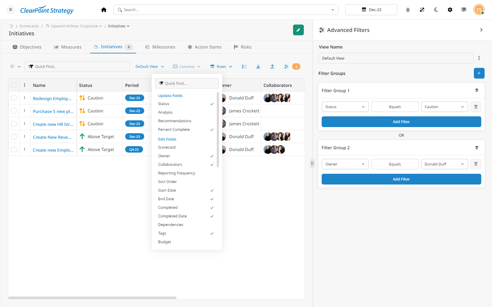
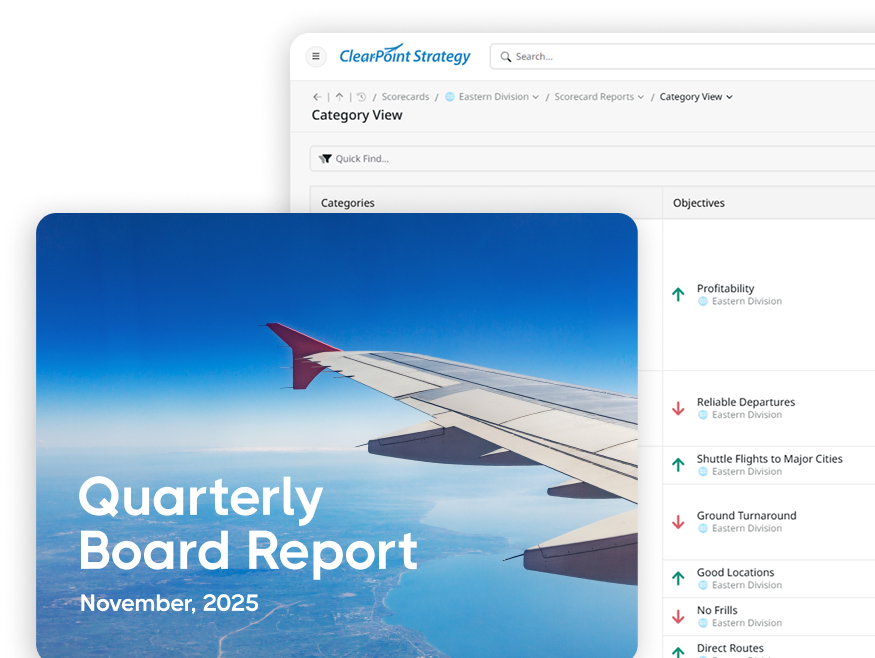
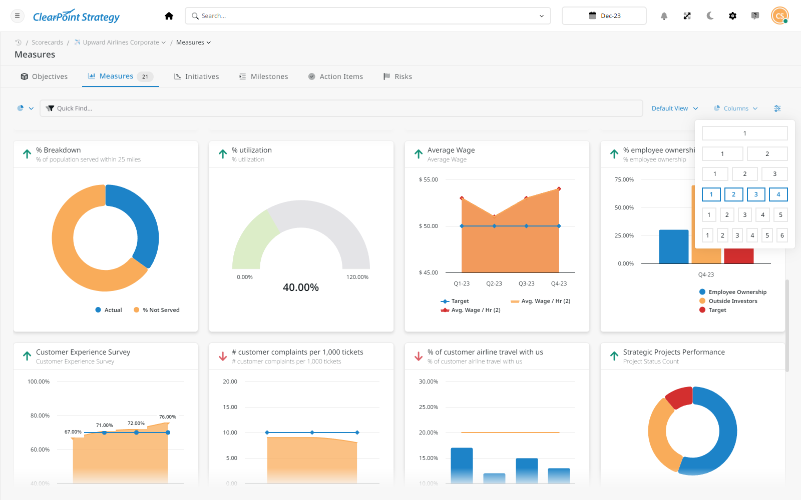
Show me one department objective rolling up into a citywide priority, and show me the report the council sees when it turns red.
The median local government on ClearPoint runs 19 separate plans and 146 active projects. Some run far more — the highest count on the platform is 472 plans in one organization. That's not disorder. That's a city with a citywide plan, a set of department plans, a capital program, an accreditation scorecard, and a grant tracker, all legitimately separate.
The problem isn't the number. It's that those plans mostly never touch each other. 84.8% of local governments never link elements with dependencies, and only 11.4% run both a strategy map and dependencies together. Nineteen plans, side by side, with nothing connecting a public-works milestone to the citywide priority it was supposed to serve.
Here's the part that matters for your decision. A small group — 19% — has no connective tissue at all: no strategy map, no dependencies. And that group behaves very differently. 73.3% of them score none of their objectives, against 14.1% of every other city. A 5.2× gap.
We'll be careful about what that means. This is a correlation across 158 organizations, not a controlled experiment. Cities that build links are probably cities with more capacity and more executive attention to begin with. Linking doesn't manufacture discipline on its own.
But as a fit signal for a buyer, it's the most useful one we have. Skipping the connective work is the single clearest marker of a plan that will go quiet. If your rollout plan is “give each department its own scorecard and check back in a year,” the tool you choose barely matters. If your rollout plan is “connect the department objectives to the four citywide priorities the council adopted,” then the ability to link across plans is the thing to interrogate hardest in the demo.
What most vendor comparisons skip
Feature grids list “strategy maps” as a checkbox. The checkbox tells you the capability exists. It doesn't tell you whether cities actually use it — and on our own platform, most don't link their plans in any durable way. When you evaluate, ask the vendor what share of their government customers have live cross-plan links, and how the tool gets a city there. Capability is not adoption. We publish our own number because we'd rather you ask us the hard version of the question.
The fewer measures a plan carries per objective, the more of them actually get scored. Every time.
What happens in your product when a plan has too many measures?
If the answer is “nothing, it scales,” that's a warning, not a feature. The fit question is whether your leadership will cut the list — not whether the tool can hold it.
The strongest predictor of whether a plan gets used is not the framework. It's leanness.
Organizations keeping under three measures per objective actively score 51.1% of them. At three to six, it's 29.9%. At six to twelve, 21.4%. Past twelve measures per objective, it falls to 16.6%.
More metrics, less measurement. Every time.
This matters for a municipal buyer specifically, because the political pressure runs the other way. Every department wants its work visible in the citywide plan. Every council member has a priority they want tracked. The plan that comes out of a good public engagement process is almost always too big, and the software will faithfully hold all of it.
So the honest fit question isn't whether the tool can handle 400 measures. They all can. It's whether your leadership team is prepared to publish a plan with fewer measures than the engagement process generated — and whether the tool helps you make that case or just absorbs the sprawl silently.
A name in an owner field is a hope, not a plan.
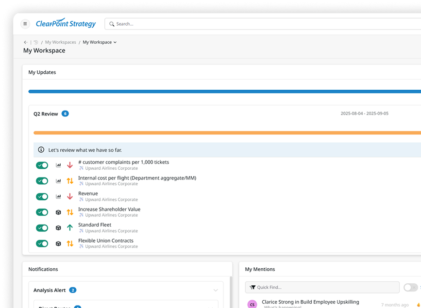
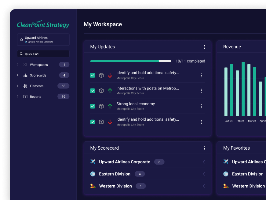
Before a measure earns a place in Dublin's plan, it has to survive one question, asked out loud: “How does it change your Tuesday?”
Brandon Brown has been with Dublin, Ohio for more than twenty years and runs performance analytics for a city of about 50,000. If nobody in the room can answer the question, the measure doesn't go in. That is the cheapest possible version of this fit test, and it costs nothing to steal.

Who chases the department that hasn't updated in two cycles — your team, or ours?
75.5% of local-government metric owners on ClearPoint have never posted a single update. Not “update infrequently.” Never, not once, since being assigned.
The platform-wide figure is 76.0%, which tells us something uncomfortable and useful: this is not a local-government problem, and no sector escapes it. Assignment is not accountability. A name in an owner field is a hope.
What moves the number is whether updating is easier than not updating. That means automated reminders that arrive with the right context, update forms a department director can fill in from a phone in four minutes, and — the part most buyers underweight — someone whose actual job includes chasing the stragglers in the first two cycles.
That last point is a fit question about your organization, not the software. If you have a performance analyst who owns this, most decent tools will work. If the plan is going to be maintained by whoever has time, you need a vendor whose implementation model includes guided implementation and managed reporting, and you should weight onboarding and support heavily in your scoring. It's consistently one of the highest-rated dimensions across this entire software category, and it's the one buyers most often score last.
The mechanics matter more than the marketing name. On ClearPoint, a red measure fires a Triggered Alert to its owner without anyone checking a dashboard by hand, updates route through a Reporting Workflow — draft, review, approve — instead of a reply-all email thread, and the person filling it in from a phone between meetings is using the same My Updates view a department director would. None of that replaces having a human who chases stragglers. It just gives that human fewer people to chase.
How well 158 local governments keep their objectives current. You might expect a few excellent, most middling, a few poor. It isn't that.
The cliff: what “actively scored” looks like across 158 cities.
If you plotted how well local governments keep their objectives current, you might expect a bell curve. A few excellent, most middling, a few poor.
It isn't a bell curve. It's a cliff.
75.3% of cities sit below 10%. Just 3.2% are above half.
That's the real benchmark to hold your shortlist against. Not “can it do this,” but “what happens to cities like mine after the launch meeting.” Ask any vendor for their distribution, not their best case study.
A caveat we'd rather state than hide
This metric counts objectives with a live status rule. A city can maintain its plan diligently and still read as 0% here if it tracks without using status rules — we have active, flagship customers in exactly that position. So treat this as a directional read on plan maintenance across the sector, not a scorecard on any individual city. We don't publish per-customer numbers for this reason.
Three questions. Take them into every demo.
A good answer walks the rollup live, in one system, without an export step. A weak answer shows you two separate screens and says they can be connected later. 84.8% of local governments never connect elements with dependencies — so watch whether the product makes it the default or the exception.
If the answer is “nothing, it scales,” treat that as a warning rather than a feature. Organizations past twelve measures per objective actively score 16.6% of them. A tool that absorbs sprawl silently will hold a very complete record of a plan nobody updates.
75.5% of local-government metric owners have never posted an update, and the platform-wide rate is 76.0% — no sector or architecture escapes it. If you don’t have a performance analyst who owns the chase, weight guided implementation and support heavily — it’s the highest-rated dimension across this software category and the one buyers score last.
Two minutes, no form. Then decide whether the 30-minute version is worth it.
No slide pitch. We build a custom report, live, with your data.
Walk through ClearPoint yourself — two minutes, no form.
We don't do a slide pitch. In 30 minutes, we build a custom report or dashboard live, with your data. Bring your adopted priorities and one department's objectives, and you'll see four things:
Your rollup, not our sample data. One department objective climbing into a citywide priority, and the council report it produces.
The red-objective path. What happens when something goes off track: who gets notified, what the update form looks like on a phone, what the council sees.
Your resident-facing dashboard. Running off the same data staff update — so you can judge whether it's something you'd put your city's name on.
The honest fit call. If you're one of the poor-fit cases below, we'll tell you on the call.
Most of the work in a plan isn't deciding — it's writing up what changed, every quarter, for every department. That's the part AI should take.
It reads the measure's own history and writes the first version of the analysis. A human still signs it.
Surfaces the measures that changed direction this period — the ones a 40-page report buries.
It only sees your objectives, measures and past commentary. No public model is trained on your data.
Where does your AI get its context — our plan, or the open internet? If it can't answer that in one sentence, don't let it write your council report.
Better to know now than in week six.
Where we do fit: cities and counties reporting to an elected body, rolling out across multiple departments, that need council-ready and resident-facing reporting to come out of the same system the staff work in.
If you're building a shortlist, our comparison of the top strategic planning platforms lays out where each one wins. For the wider sector view, start with strategic planning software for local government or the strategic planning software guide.
Eleven departments doing good work in eleven directions — and no shared direction to point them at.
After a leadership transition, Bartlett’s strategic work was scattered across departments. Real effort, real budgets, no shared plan — so nobody could say whether the city as a whole was moving.
The cost wasn’t a missing report. It was eleven separate versions of what mattered, reconciled by hand whenever leadership asked.
“Previously, you had everybody doing all these great things, but in their own separate entities.”Steve Sones · Chief Administration Officer, City of Bartlett, TN
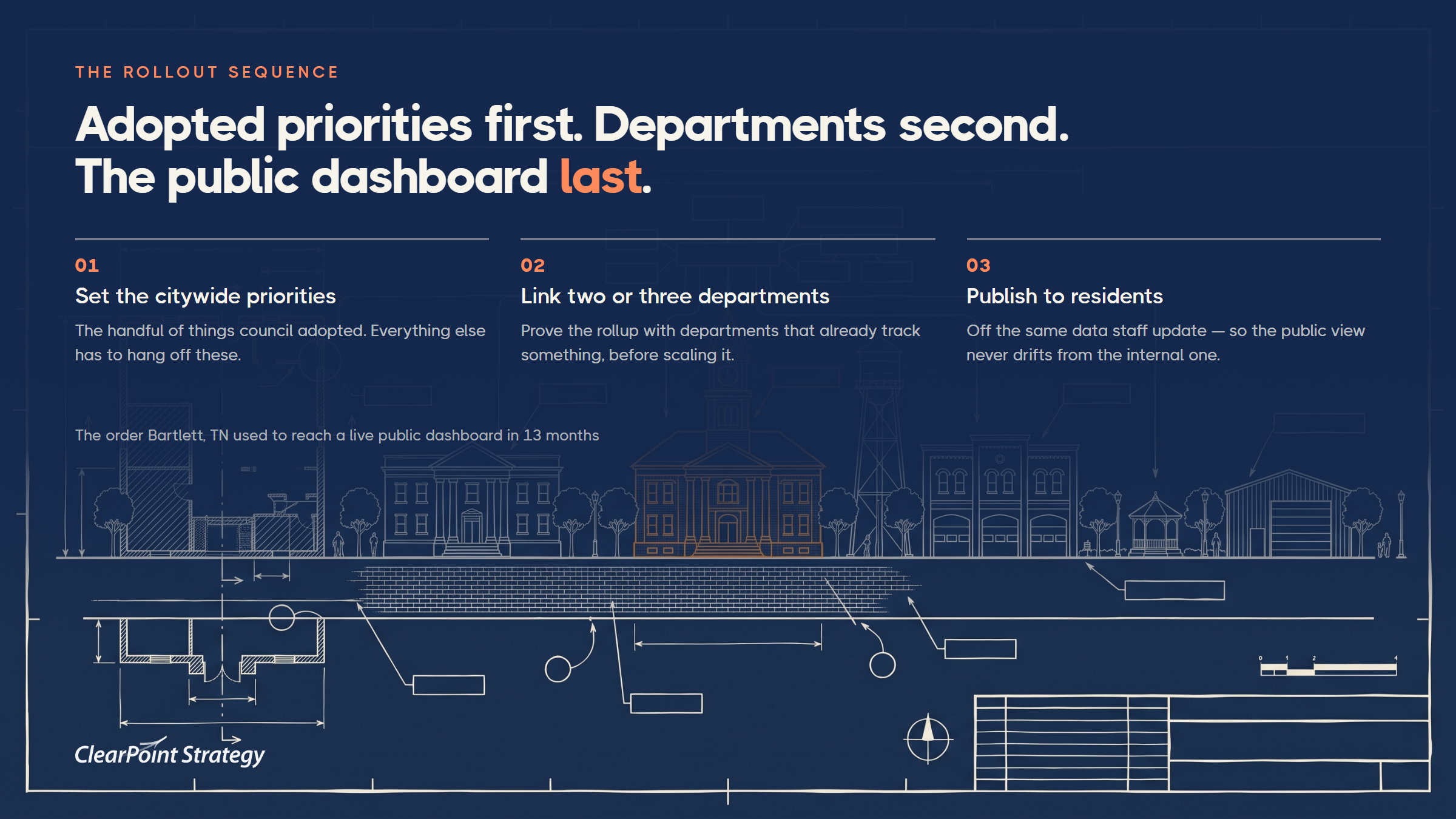
Bartlett built Bartlett Vision 2030 in 13 months, in a deliberate order: adopted priorities first, five focus areas; then department objectives linked to them; the public dashboard last.
The operating rhythm is what makes it hold — weekly department-director meetings, quarterly strategic reviews, and a partnership with the University of Memphis for public data collection.
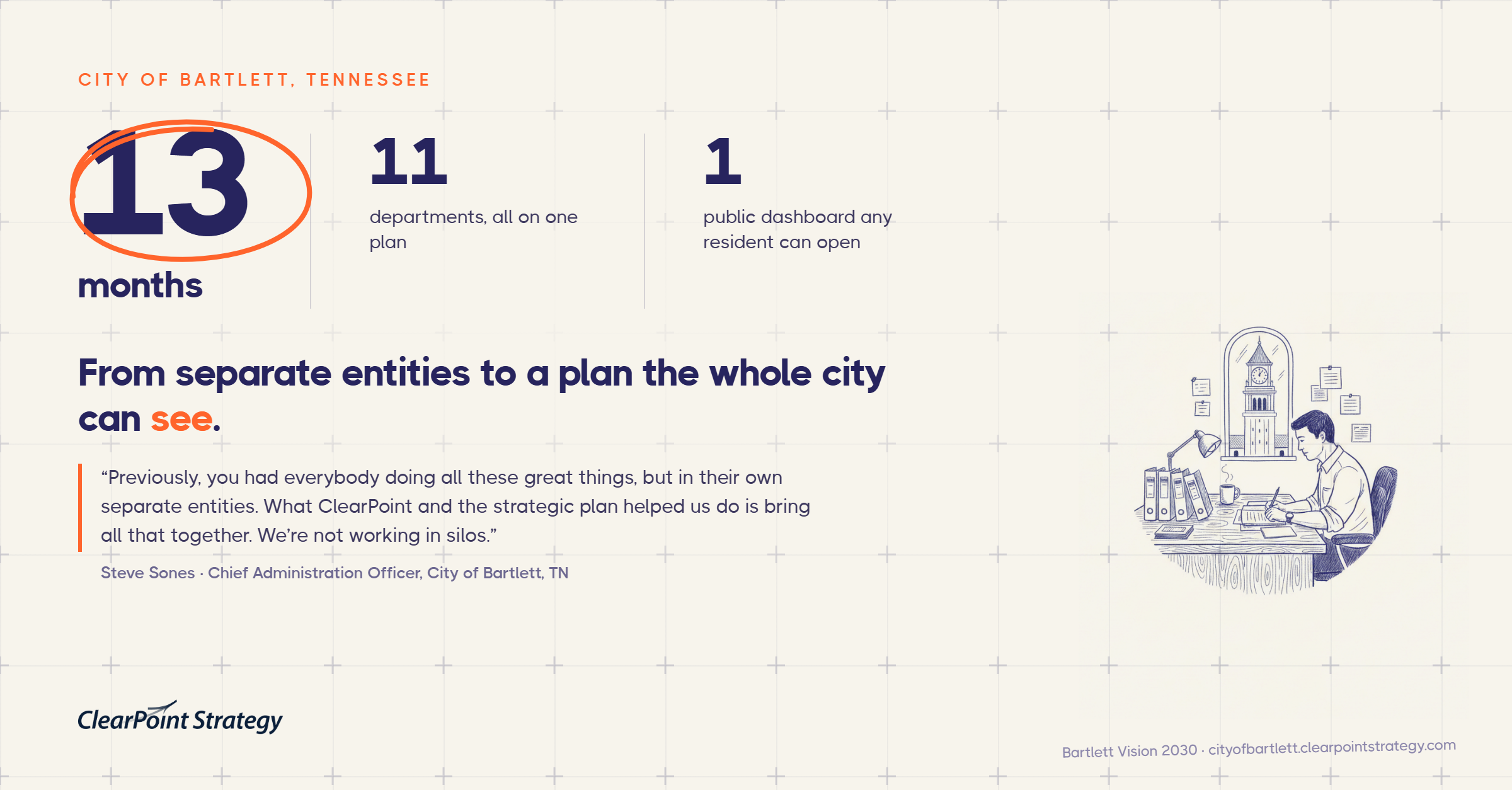
Eleven departments now report against one plan, and any resident can open the live dashboard and read the same status the city manager reads. No parallel deck, no reconciliation pass.
“What ClearPoint and the strategic plan helped us do is bring all that together. We’re not working in silos.”Steve Sones · Chief Administration Officer, City of Bartlett, TN
Two people could produce the numbers. Nobody had time left to act on them.
Durham’s performance data lived with two trained users. Every quarter turned into a collection exercise: chase the departments, retype the numbers, format the report — and then meet about it too late to change anything.
The real cost was the decisions that never got made. Budget requests arrived without evidence, so the default answer was to hire against the problem.
The city moved from two power users to more than a hundred trained staff, so the people who own a measure enter it themselves. Reporting stopped being a central bottleneck and became a by-product of the work.
Workflows, review periods and approvals run inside the plan, which is what let Durham open the same data to residents rather than maintaining a second public version.
The outcomes Durham reports are budget decisions. Police background checks were reworked once the data showed the actual load, eliminating four positions with no measured impact on safety. A 95% communications response target was already being met — so the city stopped hiring four to five officers a year against it.
Qualitatively, the shift is where the hours go: less collection, more argument about the numbers in front of people who can act on them.
“Less time putting numbers in a system and more time actually looking at the numbers and making decisions based on those.”Shari Metcalfe · Strategy and Performance Manager, City of Durham, NC
Durham runs its public dashboard on the same data. Read the City of Durham, North Carolina story →
Everything above is our data about cities. This is the part you can check yourself.
Six ClearPoint customers publish their strategic plan on a live, resident-facing dashboard. Not screenshots, not demo data — real plans, running today, under a real city's name. Open one from a city about your size.
Bartlett, TN~60,000 residents Open the live dashboard →Germantown, TN~41,000 residents Open the live dashboard →Coral Springs, FL~130,000 residents Open the live dashboard →Fort Collins, CO~170,000 residents Open the live dashboard → Fort Lauderdale, FL~169,000 residents Open the live dashboard →Durham, NC~283,000 residents Open the live dashboard →
The question worth holding while you click: could you put your city's name on this — and would you still be comfortable with it eighteen months from now.
“Previously, you had everybody doing all these great things, but in their own separate entities. What ClearPoint and the strategic plan helped us do is bring all that together. We're not working in silos.”
“I believe the framework we were able to build with strategy and performance metrics and using ClearPoint to visualize that data was a feather in our cap in achieving Baldrige designation.”
“ClearPoint is a one-stop-shop for not only our OPA work, but budget work as well.”
“ClearPoint really reduced our overall time for the process — about 75%.”

Not by us. Including Leader in Strategic Planning.









Writing the plan was never the hard part. Answering for it, eighteen months later, is.
The tools that fit municipal leadership teams share three traits: they roll department objectives up into council-adopted priorities, they generate the council report from the same data staff work in, and they publish resident-facing dashboards without a second build. ClearPoint, Envisio and AchieveIt all serve this market; the differentiator to test is whether the council report and the public dashboard come out of one system or three.
Plan on a first reporting cycle within one quarter and full multi-department coverage within two to three. Bartlett, Tennessee built a complete plan across all 11 of its departments in 13 months, but that included the strategic planning process itself, not just the software. If you already have an adopted plan, the software timeline is much shorter than the planning timeline.
Start with the citywide priorities and two or three departments that already track something, then extend. The reason is in the platform data: 84.8% of local governments never link elements with dependencies, and that gap is hardest to close retroactively. Establishing the rollup structure with a few departments first makes the rest of the rollout a copy rather than a redesign.
Two things travel well across transitions: a small measure set and a public dashboard. Cities keeping under three measures per objective actively score 51.1% of them, against 16.6% past twelve — and a plan already visible to residents is much harder to quietly abandon. What doesn't survive is a plan held together by one analyst's spreadsheet knowledge.
Fewer than your engagement process will produce. On the ClearPoint platform, organizations keeping under three measures per objective actively score 51.1% of them; past twelve measures per objective, only 16.6% get scored. The constraint is attention, not software capacity.
It should be the source of it. When the resident-facing dashboard is a separate export, it drifts from the internal numbers and someone has to reconcile them before every council meeting. Cities like Bartlett, Tennessee run the public dashboard directly off the same plan data staff update.
It fits small cities that report to a council and roll out across multiple departments — Bartlett has about 60,000 residents and 11 departments. It's a weaker fit for a single department that wants a fast self-serve tracker, or for a team committed to a pure OKR practice. Those cases are better served elsewhere, and we say so on the fit page above.


Don't want to schedule a demo yet? No worries. Just enter your contact info below to get instant access to an interactive tour of ClearPoint.


.webp)