
200+ KPI examples by function and industry, each with a definition, formula, and worked example — plus ClearPoint data on which KPIs get owned and completed.
A key performance indicator (KPI) is a quantifiable measure of progress toward a specific goal. A good KPI example is specific, tied to a target, owned by one person, and reviewed on a set cadence. The best ones are few. That is the whole definition.
Here is the part nobody tells you.
We pulled the numbers from more than 20,500 strategic plans across 500+ organizations on the ClearPoint platform. Two-thirds of the KPIs on it — 67% — have no owner. Most are never updated again. Finding KPI examples was never the hard part. Choosing the few that someone actually runs is.
So this page does both jobs. Below you will find more than 200 KPI examples, organized by business function and by industry. Each one comes with a plain definition, the formula, and a worked example. Then we show you what the data says about the handful worth keeping. Jump to your function or your industry, or read straight through.
- A KPI (key performance indicator) is a quantifiable measure of progress toward a goal. A good one is specific, has a formula and a target, is reviewed on a cadence, and has one named owner.
- This guide lists 200+ KPI examples by function (sales, marketing, finance, HR, operations, customer service, IT, project management) and by industry (local government, healthcare, education, utilities, banking, and more) — each with a definition, formula, and worked example.
- Track 5–9 KPIs, not dozens. More measures do not mean more progress.
- The top reason KPIs fail is ownership: across 20,500+ strategic plans, 67% of KPIs have no owner — and projects with a named owner are completed about 2.5× as often.
- Pair every lagging KPI (the result) with a leading KPI (the early signal), and give each one a single named owner.
On this page
KPI examples by function: Sales · Marketing · Financial · HR & Human Capital · Operations & Supply Chain · Customer Service · IT · Project Management
KPI examples by industry: Local Government · Healthcare · Higher Education · Utilities & Energy · Banking · Manufacturing · Retail & E-commerce · SaaS · Nonprofit
Then: What good KPIs share · What 20,500+ plans reveal · How to choose yours · How to build & track them · FAQ · References
What makes a good KPI example
Most KPI lists hand you names and walk away. A name is not a KPI. The KPIs that move a strategy share four traits, and the examples below are built around them.
A KPI is not a metric. You can measure a thousand things. Page views, headcount, calls answered — those are metrics. A KPI is the small set of metrics you have decided are worth steering by, because each one ties to a goal. Every KPI is a metric. Very few metrics earn the title KPI.
Good KPIs come in two flavors: leading and lagging. A lagging KPI tells you what already happened — revenue, churn, graduation rate. A leading KPI hints at what is coming — pipeline coverage, response time, training hours. Lagging KPIs are easier to trust. Leading KPIs are easier to act on. Strong scorecards pair them, so each result has an early-warning partner. Every example below is tagged so you can see which is which.
A good KPI example has five parts. A clear name. A formula you can compute. A target. A review cadence. And an owner — one person, by name. Drop any one of these and the KPI quietly stops working. The fifth part is the one almost everyone skips, and it is the one that decides whether the KPI survives.
We can prove that last point with our own data. Across the platform, projects with a named owner are completed about 2.5 times as often as projects with none. So as you browse these examples, do not just collect names. For each KPI you keep, write down who owns it. That single move separates a scorecard that runs from a list that rots.
KPI examples by function
Start here if you are building a scorecard for a team. Each function below lists its core KPIs with a definition, a formula, and a worked example. Where we run a deeper library, you will see a link to it.
Sales KPIs
Sales KPIs connect day-to-day rep activity to revenue outcomes, exposing whether the pipeline is healthy enough to hit the number and where deals stall on the way to closed-won. The strongest sales scorecards pair leading indicators you can still influence (coverage, conversion, cycle time) with the lagging results they ultimately produce (win rate, recurring revenue, retention).
↓ Go deeper: See the full Sales KPIs guide →
Win Rate (Lagging)
Definition: The share of qualified opportunities that close as won over a period. Formula: (Deals won ÷ total qualified opportunities) × 100. Example: 45 won ÷ 180 qualified = 25%.
What good looks like: B2B win rates commonly run 15–30% of qualified opportunities; clearing ~30% consistently is strong · Weak vs strong: "We close a decent amount of our deals" → "Lift mid-market win rate from 25% to 32% by Q4, owned by the VP of Sales."
Sales Cycle Length (Lagging)
Definition: The average elapsed time from opportunity creation to closed-won. Formula: Total days to close across won deals ÷ number of won deals. Example: 5,400 days ÷ 90 deals = 60 days.
Quota Attainment (Lagging)
Definition: How much of an assigned sales target a rep or team has achieved. Formula: (Actual bookings ÷ quota) × 100. Example: $480,000 ÷ $600,000 = 80%.
Pipeline Coverage Ratio (Leading)
Definition: The amount of open pipeline relative to the revenue target for a period, signaling whether enough opportunities exist to hit goal. Formula: Open pipeline value ÷ revenue target. Example: $3,000,000 ÷ $1,000,000 = 3.0×.
Average Deal Size (Lagging)
Definition: The mean revenue value of a closed-won deal in a period. Formula: Total closed-won revenue ÷ number of won deals. Example: $900,000 ÷ 90 = $10,000.
Lead-to-Opportunity Conversion Rate (Leading)
Definition: The share of qualified leads that advance into sales opportunities. Formula: (Opportunities created ÷ qualified leads) × 100. Example: 300 opportunities ÷ 1,200 leads = 25%.
Sales Velocity (Leading)
Definition: The rate at which revenue moves through the pipeline, combining opportunity volume, deal size, win rate, and cycle length. Formula: (Number of opportunities × average deal size × win rate) ÷ sales cycle length in days. Example: (200 × $10,000 × 0.25) ÷ 50 = $10,000/day.
Monthly Recurring Revenue (MRR) (Lagging)
Definition: The predictable subscription revenue normalized to a single month. Formula: Sum of all active monthly subscription fees. Example: 500 customers × $200/month = $100,000 MRR.
Annual Recurring Revenue (ARR) (Lagging)
Definition: The predictable subscription revenue normalized to a full year. Formula: MRR × 12. Example: $100,000 MRR × 12 = $1,200,000 ARR.
Customer Acquisition Cost (CAC) (Lagging)
Definition: The fully loaded sales and marketing cost to acquire one new customer. Formula: Total sales and marketing spend ÷ new customers acquired. Example: $300,000 ÷ 100 = $3,000.
Customer Lifetime Value (LTV) (Lagging)
Definition: The total gross profit expected from a customer over the entire relationship. Formula: Average revenue per account × gross margin × average customer lifespan. Example: $6,000/year × 0.75 × 4 years = $18,000.
LTV:CAC Ratio (Lagging)
Definition: The ratio of customer lifetime value to the cost of acquiring that customer, measuring acquisition efficiency. Formula: Customer lifetime value ÷ customer acquisition cost. Example: $18,000 ÷ $3,000 = 6.0:1.
What good looks like: 3:1 is the widely cited healthy target — below 1:1 you lose money on every customer, while above ~5:1 can mean you're under-investing in growth · Weak vs strong: "Our customers are worth more than they cost to win" → "Hold blended LTV:CAC at or above 3:1 while scaling spend 20%, reviewed monthly by RevOps."
Net Revenue Retention (NRR) (Lagging)
Definition: The percentage of recurring revenue retained from existing customers including expansion, net of churn and contraction. Formula: ((Starting recurring revenue + expansion − contraction − churn) ÷ starting recurring revenue) × 100. Example: (($1,000,000 + $150,000 − $50,000 − $100,000) ÷ $1,000,000) × 100 = 110%.
Upsell/Cross-sell Rate (Lagging)
Definition: The share of existing customers who purchase an upgrade or an additional product in a period. Formula: (Customers with an upsell or cross-sell ÷ total existing customers) × 100. Example: 120 ÷ 1,000 = 12%.
New Logos Acquired (Lagging)
Definition: The count of brand-new customer accounts won in a period, excluding expansion of existing accounts. Formula: Sum of net-new customer accounts closed in the period. Example: 28 net-new accounts in the quarter = 28 new logos.
Marketing KPIs
Marketing KPIs trace the journey from spend to pipeline, showing which channels generate demand efficiently and how cleanly that demand converts into sales-ready opportunities. A balanced set watches leading signals of demand creation (traffic, leads, engagement) alongside the lagging proof that marketing influenced revenue (sourced pipeline, ROMI, conversion to SQL).
Marketing Qualified Leads (MQLs) (Leading)
Definition: The count of leads that meet the agreed marketing-qualification threshold and are passed toward sales. Formula: Sum of leads reaching the defined MQL score or criteria in a period. Example: 600 leads crossed the MQL threshold last month = 600 MQLs.
Sales Qualified Leads (SQLs) (Leading)
Definition: The count of MQLs that sales accepts as genuine opportunities worth active pursuit. Formula: Sum of leads accepted by sales as qualified in a period. Example: 180 of the month's MQLs were accepted = 180 SQLs.
Cost Per Lead (CPL) (Lagging)
Definition: The average marketing cost to generate a single lead. Formula: Total campaign spend ÷ number of leads generated. Example: $60,000 ÷ 1,200 = $50.
Lead Conversion Rate (Lagging)
Definition: The share of leads that complete the desired next step, such as becoming an opportunity or a customer. Formula: (Conversions ÷ total leads) × 100. Example: 120 conversions ÷ 1,200 leads = 10%.
What good looks like: this varies enormously by source — low single digits for cold traffic, double digits for high-intent demo requests — so judge it against your own baseline, not a universal number · Weak vs strong: "Our leads convert reasonably well" → "Raise demo-request lead conversion from 10% to 14% by improving form UX, owned by the demand-gen lead this quarter."
Return on Marketing Investment (ROMI) (Lagging)
Definition: The profit generated for every dollar invested in marketing, net of the marketing cost itself. Formula: ((Revenue attributed to marketing − marketing cost) ÷ marketing cost) × 100. Example: (($500,000 − $100,000) ÷ $100,000) × 100 = 400%.
What good looks like: a 5:1 revenue-to-cost ratio (~400% ROMI) is a common 'good' bar; roughly 2:1 is break-even once gross margin is counted · Weak vs strong: "Marketing drives a lot of revenue" → "Deliver a 4:1 ROMI on the paid-search program in H2, reported monthly against attributed pipeline by the marketing ops manager."
Return on Ad Spend (ROAS) (Lagging)
Definition: The revenue generated for every dollar spent on advertising. Formula: Revenue from ads ÷ ad spend. Example: $250,000 ÷ $50,000 = 5.0× (or 500%).
Organic Traffic (Leading)
Definition: The number of website visits arriving from unpaid search and other non-paid channels. Formula: Sum of non-paid sessions to the site in a period. Example: 80,000 unpaid sessions last month = 80,000 organic visits.
Click-Through Rate (CTR) (Leading)
Definition: The share of people who click an ad, link, or result after seeing it. Formula: (Clicks ÷ impressions) × 100. Example: 2,000 clicks ÷ 100,000 impressions = 2%.
Email Open Rate (Leading)
Definition: The share of delivered emails that recipients open. Formula: (Emails opened ÷ emails delivered) × 100. Example: 4,000 opens ÷ 20,000 delivered = 20%.
Email Click Rate (Leading)
Definition: The share of delivered emails in which a recipient clicks at least one link. Formula: (Emails with a click ÷ emails delivered) × 100. Example: 600 clicks ÷ 20,000 delivered = 3%.
Website Bounce Rate (Lagging)
Definition: The share of sessions in which a visitor leaves after viewing only one page without further interaction. Formula: (Single-page sessions ÷ total sessions) × 100. Example: 4,500 single-page sessions ÷ 10,000 sessions = 45%.
Marketing-Sourced Pipeline (Lagging)
Definition: The total value of sales pipeline originated by marketing-generated leads. Formula: Sum of opportunity value where marketing created the originating lead. Example: 50 opportunities × $20,000 average value = $1,000,000.
Brand Search Volume (Leading)
Definition: The number of searches that include the company or product name, indicating brand demand. Formula: Sum of monthly search queries containing the brand term. Example: 12,000 branded queries last month = 12,000 searches.
Cost Per Acquisition (CPA) (Lagging)
Definition: The average marketing cost to acquire one customer or completed conversion. Formula: Total campaign spend ÷ number of acquisitions. Example: $100,000 ÷ 250 = $400.
Marketing Qualified Lead-to-SQL Rate (Lagging)
Definition: The share of MQLs that sales accepts and qualifies as SQLs, measuring lead quality and handoff alignment. Formula: (SQLs ÷ MQLs) × 100. Example: 180 SQLs ÷ 600 MQLs = 30%.
Financial KPIs
Financial KPIs measure whether the business turns revenue into profit, collects cash efficiently, and stays solvent enough to fund its plans. Most are lagging indicators read from closed financials, so they are best paired with operational leading metrics that explain why the numbers moved.
↓ Go deeper: Browse the Financial KPI Library — 68 measures →
Gross Profit Margin (Lagging)
Definition: The share of revenue left after the direct cost of goods sold. Formula: ((Revenue − cost of goods sold) ÷ revenue) × 100. Example: (($1,000,000 − $400,000) ÷ $1,000,000) × 100 = 60%.
Net Profit Margin (Lagging)
Definition: The share of revenue remaining as profit after all expenses, interest, and taxes. Formula: (Net income ÷ revenue) × 100. Example: $120,000 ÷ $1,000,000 = 12%.
What good looks like: ~10% net margin is broadly 'good' and 20%+ is excellent — but it is highly sector-dependent (software runs far higher than grocery) · Weak vs strong: "We're profitable overall" → "Expand net profit margin from 12% to 15% within the fiscal year by reducing overhead, owned by the CFO."
Operating Margin (Lagging)
Definition: The share of revenue left as operating profit after operating expenses but before interest and taxes. Formula: (Operating income ÷ revenue) × 100. Example: $180,000 ÷ $1,000,000 = 18%.
EBITDA (Lagging)
Definition: Earnings before interest, taxes, depreciation, and amortization, used as a proxy for core operating cash generation. Formula: Net income + interest + taxes + depreciation + amortization. Example: $120,000 + $30,000 + $40,000 + $50,000 + $10,000 = $250,000.
Revenue Growth Rate (Lagging)
Definition: The percentage change in revenue from one period to the next. Formula: ((Current period revenue − prior period revenue) ÷ prior period revenue) × 100. Example: (($1,200,000 − $1,000,000) ÷ $1,000,000) × 100 = 20%.
Current Ratio (Lagging)
Definition: A liquidity measure of whether current assets can cover current liabilities. Formula: Current assets ÷ current liabilities. Example: $600,000 ÷ $300,000 = 2.0.
Quick Ratio (Lagging)
Definition: A stricter liquidity measure that excludes inventory from current assets. Formula: (Current assets − inventory) ÷ current liabilities. Example: ($600,000 − $150,000) ÷ $300,000 = 1.5.
Days Sales Outstanding (DSO) (Lagging)
Definition: The average number of days it takes to collect payment after a sale. Formula: (Accounts receivable ÷ total credit sales) × number of days in the period. Example: ($300,000 ÷ $1,800,000) × 90 = 15 days.
Accounts Payable Turnover (Lagging)
Definition: How many times a company pays off its average accounts payable during a period. Formula: Total supplier purchases ÷ average accounts payable. Example: $1,200,000 ÷ $200,000 = 6.0×.
Cash Conversion Cycle (Lagging)
Definition: The number of days it takes to convert investments in inventory and receivables back into cash, net of payables. Formula: Days inventory outstanding + days sales outstanding − days payable outstanding. Example: 40 + 15 − 25 = 30 days.
Burn Rate (Leading)
Definition: The rate at which a company spends its cash reserves each month, net of revenue. Formula: (Starting cash − ending cash) ÷ number of months. Example: ($1,200,000 − $900,000) ÷ 3 = $100,000/month.
Cash Runway (Leading)
Definition: The number of months a company can operate before exhausting its cash at the current burn rate. Formula: Current cash balance ÷ monthly net burn rate. Example: $900,000 ÷ $100,000 = 9 months.
Working Capital (Lagging)
Definition: The short-term capital available to fund daily operations. Formula: Current assets − current liabilities. Example: $600,000 − $300,000 = $300,000.
Return on Equity (ROE) (Lagging)
Definition: The profit generated for every dollar of shareholders' equity. Formula: (Net income ÷ shareholders' equity) × 100. Example: $120,000 ÷ $800,000 = 15%.
Return on Assets (ROA) (Lagging)
Definition: The profit generated for every dollar of total assets, measuring how efficiently assets produce earnings. Formula: (Net income ÷ total assets) × 100. Example: $120,000 ÷ $1,500,000 = 8%.
Budget Variance (Lagging)
Definition: The difference between budgeted and actual figures, showing how closely spending or revenue tracked the plan. Formula: ((Actual − budgeted) ÷ budgeted) × 100. Example: (($1,050,000 − $1,000,000) ÷ $1,000,000) × 100 = +5%.
What good looks like: mature finance teams hold variance within ±5% (often ±3% on operating budgets); the goal is small and explained, not zero · Weak vs strong: "We came in close to budget" → "Keep departmental budget variance within ±3% each quarter, with monthly reviews owned by the finance business partner."
HR & Human Capital KPIs
HR KPIs measure how effectively an organization attracts, develops, and retains its people. They blend lagging outcomes like turnover with leading signals like engagement and time to productivity.
↓ Go deeper: See 50+ HR & human capital KPI examples →
Employee Turnover Rate (Lagging)
Definition: The rate at which employees leave the organization over a period. Formula: (Separations ÷ average headcount) × 100. Example: 18 leavers ÷ 200 avg headcount = 9%.
What good looks like: ~10% annual voluntary turnover is often considered healthy; sustained 20%+ usually signals a retention problem, though it varies sharply by sector · Weak vs strong: "Keep turnover low" → "Hold voluntary turnover below 10% annually, owned by the People team, reviewed each quarter".
Employee Retention Rate (Lagging)
Definition: The share of employees who stay with the organization over a period. Formula: (Employees retained ÷ headcount at start) × 100. Example: 184 retained ÷ 200 at start = 92%.
Time to Fill (Lagging)
Definition: The average number of days from opening a requisition to a candidate accepting the offer. Formula: Total days to fill ÷ number of roles filled. Example: 1,200 days ÷ 30 hires = 40 days.
Cost Per Hire (Lagging)
Definition: The average total recruiting cost to fill one open role. Formula: (Internal + external recruiting costs) ÷ number of hires. Example: $120,000 ÷ 30 hires = $4,000.
Employee Net Promoter Score (eNPS) (Leading)
Definition: A measure of how likely employees are to recommend the organization as a place to work. Formula: % Promoters − % Detractors. Example: 55% promoters − 15% detractors = +40.
Absenteeism Rate (Lagging)
Definition: The proportion of scheduled workdays lost to unplanned absence. Formula: (Absent days ÷ total scheduled workdays) × 100. Example: 400 absent days ÷ 50,000 scheduled = 0.8%.
Revenue Per Employee (Lagging)
Definition: The average revenue generated per full-time employee, a proxy for workforce productivity. Formula: Total revenue ÷ total headcount. Example: $40,000,000 ÷ 200 employees = $200,000.
Training Hours Per Employee (Leading)
Definition: The average hours of formal training delivered per employee over a period. Formula: Total training hours ÷ total headcount. Example: 4,000 hours ÷ 200 employees = 20 hours.
Offer Acceptance Rate (Leading)
Definition: The share of job offers extended that candidates accept. Formula: (Offers accepted ÷ offers extended) × 100. Example: 27 accepted ÷ 30 extended = 90%.
Quality of Hire (Lagging)
Definition: A composite score of how well new hires perform and stay after joining. Formula: Average of new-hire performance, retention, and ramp scores (indexed to 100). Example: (90 performance + 85 retention + 80 ramp) ÷ 3 = 85.
What good looks like: there is no universal number — define it as a composite of ramp time, performance, and one-year retention, then beat your own trailing baseline · Weak vs strong: "Hire good people" → "Reach a 90-day quality-of-hire index of 85+, owned by hiring managers, scored at each 90-day review".
Time to Productivity (Leading)
Definition: The average time for a new hire to reach full expected performance. Formula: Total days to full productivity ÷ number of new hires. Example: 2,700 days ÷ 30 hires = 90 days.
Internal Mobility Rate (Leading)
Definition: The share of roles filled by existing employees moving internally. Formula: (Internal moves ÷ total roles filled) × 100. Example: 12 internal moves ÷ 40 roles = 30%.
Employee Engagement Score (Leading)
Definition: The average level of employee commitment and motivation from survey responses. Formula: (Favorable responses ÷ total responses) × 100. Example: 1,360 favorable ÷ 1,700 total = 80%.
Diversity Ratio (Lagging)
Definition: The representation of a given group within the workforce. Formula: (Employees in group ÷ total headcount) × 100. Example: 90 ÷ 200 employees = 45%.
Voluntary vs Involuntary Turnover (Lagging)
Definition: The split of departures initiated by employees versus by the organization. Formula: (Voluntary separations ÷ total separations) × 100. Example: 14 voluntary ÷ 18 total = 78% voluntary.
Operations & Supply Chain KPIs
Operations and supply chain KPIs track how efficiently work flows from input to delivered output. They expose bottlenecks, quality losses, and reliability gaps across production and fulfillment.
Overall Equipment Effectiveness (OEE) (Lagging)
Definition: A composite measure of how productively equipment is used, combining availability, performance, and quality. Formula: Availability × Performance × Quality. Example: 90% × 95% × 99% = ~85%.
What good looks like: 85% OEE is the textbook gold-standard mark; ~60% is typical for discrete manufacturers, and under 40% signals major hidden losses · Weak vs strong: "Run machines efficiently" → "Hold line OEE at 85%+, owned by the plant manager, reviewed weekly per production line".
Cycle Time (Lagging)
Definition: The average time to complete one unit of work from start to finish. Formula: Total production time ÷ units produced. Example: 600 minutes ÷ 300 units = 2 minutes/unit.
Throughput (Lagging)
Definition: The number of units produced or processed per unit of time. Formula: Units produced ÷ time period. Example: 4,800 units ÷ 8 hours = 600 units/hour.
On-Time Delivery Rate (Lagging)
Definition: The share of orders delivered on or before the promised date. Formula: (On-time deliveries ÷ total deliveries) × 100. Example: 950 on-time ÷ 1,000 = 95%.
What good looks like: leading supply chains target 95%+ on-time-in-full; slipping below ~90% starts to erode customer trust · Weak vs strong: "Ship orders on time" → "Hit 98% on-time delivery against promised dates, owned by the fulfillment lead, reviewed weekly".
Order Accuracy Rate (Lagging)
Definition: The share of orders shipped complete and error-free. Formula: (Accurate orders ÷ total orders) × 100. Example: 990 accurate ÷ 1,000 = 99%.
Inventory Turnover (Lagging)
Definition: How many times inventory is sold and replaced over a period. Formula: Cost of goods sold ÷ average inventory. Example: $6,000,000 ÷ $1,000,000 = 6 turns.
Capacity Utilization (Leading)
Definition: The share of available production capacity actually used. Formula: (Actual output ÷ maximum possible output) × 100. Example: 800 units ÷ 1,000 capacity = 80%.
Defect Rate (Lagging)
Definition: The proportion of units produced that fail to meet quality standards. Formula: (Defective units ÷ total units) × 100. Example: 15 defects ÷ 1,000 units = 1.5%.
First Pass Yield (Lagging)
Definition: The share of units that pass through production correctly the first time without rework. Formula: (Good units first pass ÷ total units started) × 100. Example: 940 ÷ 1,000 = 94%.
Lead Time (Lagging)
Definition: The total elapsed time from order placement to delivery. Formula: Delivery date − order date (averaged). Example: 140 total days ÷ 20 orders = 7 days.
Backorder Rate (Lagging)
Definition: The share of orders that cannot be fulfilled from current stock. Formula: (Backordered items ÷ total ordered items) × 100. Example: 30 backordered ÷ 1,000 = 3%.
Cost Per Unit (Lagging)
Definition: The average total cost to produce one unit of output. Formula: Total production cost ÷ units produced. Example: $300,000 ÷ 60,000 units = $5/unit.
Unplanned Downtime (Lagging)
Definition: The share of scheduled production time lost to unexpected stoppages. Formula: (Unplanned downtime ÷ scheduled production time) × 100. Example: 12 hours ÷ 160 hours = 7.5%.
Customer Service & Success KPIs
Customer service and success KPIs measure how well an organization resolves issues and retains customers. They pair satisfaction signals with operational speed and loyalty outcomes.
Customer Satisfaction (CSAT) (Lagging)
Definition: The share of customers who report being satisfied after an interaction. Formula: (Satisfied responses ÷ total responses) × 100. Example: 880 satisfied ÷ 1,000 = 88%.
What good looks like: 75–85% satisfied is a common 'good' band, but the trend and the reasons behind your detractors matter more than the absolute score · Weak vs strong: "Keep customers happy" → "Maintain a 90%+ CSAT on post-resolution surveys, owned by the support manager, reviewed monthly".
Net Promoter Score (NPS) (Lagging)
Definition: A measure of customer loyalty based on likelihood to recommend. Formula: % Promoters − % Detractors. Example: 60% promoters − 15% detractors = +45.
Customer Effort Score (CES) (Leading)
Definition: How much effort customers feel they expended to get an issue resolved. Formula: Sum of effort ratings ÷ number of responses (typically 1–7). Example: 1,500 ÷ 1,000 responses = 1.5.
First Response Time (Leading)
Definition: The average time between a customer raising a ticket and the first reply. Formula: Total first-response time ÷ number of tickets. Example: 2,000 minutes ÷ 1,000 tickets = 2 minutes.
Average Resolution Time (Lagging)
Definition: The average time taken to fully resolve a customer issue. Formula: Total resolution time ÷ number of resolved tickets. Example: 4,000 hours ÷ 1,000 tickets = 4 hours.
First Contact Resolution Rate (Lagging)
Definition: The share of issues resolved in a single interaction without follow-up. Formula: (Issues resolved on first contact ÷ total issues) × 100. Example: 750 ÷ 1,000 = 75%.
What good looks like: ~70%+ FCR is widely considered strong; every point of FCR tends to cut repeat contacts and cost-to-serve · Weak vs strong: "Resolve issues fast" → "Resolve 80% of tickets on first contact, owned by the support team lead, reviewed weekly by channel".
Ticket Volume (Leading)
Definition: The total number of support tickets received over a period. Formula: Count of tickets created in the period. Example: 5,000 tickets in a month = 5,000.
Ticket Backlog (Lagging)
Definition: The number of unresolved tickets remaining open at a point in time. Formula: Tickets opened − tickets closed (cumulative). Example: 1,000 opened − 900 closed = 100 open.
Customer Churn Rate (Lagging)
Definition: The share of customers lost over a period. Formula: (Customers lost ÷ customers at start) × 100. Example: 50 lost ÷ 1,000 = 5%.
Customer Retention Rate (Lagging)
Definition: The share of customers kept over a period, excluding new acquisitions. Formula: ((Customers at end − new customers) ÷ customers at start) × 100. Example: (1,050 − 100) ÷ 1,000 = 95%.
SLA Compliance Rate (Lagging)
Definition: The share of tickets resolved within the agreed service-level target. Formula: (Tickets meeting SLA ÷ total tickets) × 100. Example: 970 ÷ 1,000 = 97%.
Escalation Rate (Lagging)
Definition: The share of tickets escalated beyond the first support tier. Formula: (Escalated tickets ÷ total tickets) × 100. Example: 80 escalated ÷ 1,000 = 8%.
Customer Health Score (Leading)
Definition: A composite index predicting how likely an account is to renew or churn. Formula: Weighted average of usage, engagement, and support signals (indexed to 100). Example: (80 usage + 70 engagement + 90 support) weighted = 80.
IT KPIs
IT KPIs measure the reliability, responsiveness, and security of technology services. They focus on uptime, incident recovery speed, and how quickly teams detect and resolve problems.
System Uptime / Availability (Lagging)
Definition: The share of time a system is operational and available to users. Formula: (Uptime ÷ total scheduled time) × 100. Example: 7,128 hours ÷ 7,200 = 99%.
What good looks like: 99.9% ('three nines') still leaves ~8.8 hours of downtime a year; critical systems target 99.99% · Weak vs strong: "Keep systems up" → "Maintain 99.9% availability for tier-1 systems, owned by the infrastructure lead, reviewed monthly against SLA".
Mean Time to Repair (MTTR) (Lagging)
Definition: The average time to restore service after an incident occurs. Formula: Total repair time ÷ number of incidents. Example: 500 minutes ÷ 10 incidents = 50 minutes.
What good looks like: there is no universal target — set it against your SLA and drive the trend down; elite teams restore tier-1 service in under an hour · Weak vs strong: "Fix outages quickly" → "Restore tier-1 service within 60 minutes (MTTR), owned by the on-call lead, reviewed per incident".
Mean Time Between Failures (MTBF) (Lagging)
Definition: The average operating time between system failures, a measure of reliability. Formula: Total operating time ÷ number of failures. Example: 10,000 hours ÷ 10 failures = 1,000 hours.
Mean Time to Detect (MTTD) (Lagging)
Definition: The average time between an issue arising and the team detecting it. Formula: Total detection time ÷ number of incidents. Example: 150 minutes ÷ 10 incidents = 15 minutes.
Incident Volume (Leading)
Definition: The total number of IT incidents logged over a period. Formula: Count of incidents in the period. Example: 120 incidents in a month = 120.
Average System Response Time (Leading)
Definition: The average time a system takes to respond to a request. Formula: Total response time ÷ number of requests. Example: 2,000 ms ÷ 10,000 requests = 200 ms.
Ticket Resolution Time (Lagging)
Definition: The average time to close an IT support ticket. Formula: Total resolution time ÷ number of tickets. Example: 3,000 hours ÷ 1,000 tickets = 3 hours.
Cost Per Ticket (Lagging)
Definition: The average cost to handle one IT support ticket. Formula: Total support cost ÷ number of tickets. Example: $25,000 ÷ 1,000 tickets = $25.
Security Incident Count (Lagging)
Definition: The number of confirmed security incidents over a period. Formula: Count of verified security incidents in the period. Example: 4 incidents in a quarter = 4.
Patch Compliance Rate (Leading)
Definition: The share of systems patched to the required level within policy timelines. Formula: (Compliant systems ÷ total systems) × 100. Example: 950 ÷ 1,000 = 95%.
Backup Success Rate (Lagging)
Definition: The share of scheduled backups that complete successfully. Formula: (Successful backups ÷ total scheduled backups) × 100. Example: 990 ÷ 1,000 = 99%.
Sprint Velocity (Lagging)
Definition: The average amount of work a development team completes per sprint. Formula: Total story points completed ÷ number of sprints. Example: 120 points ÷ 3 sprints = 40 points/sprint.
Project Management KPIs
Project management KPIs track whether work is delivered on time, on budget, and within scope. Earned value metrics turn schedule and cost performance into early warning signals.
↓ Go deeper: See the 30 project management KPIs to track →
On-Time Completion Rate (Lagging)
Definition: The share of projects or tasks completed by their planned due date. Formula: (Completed on time ÷ total completed) × 100. Example: 45 on time ÷ 50 = 90%.
What good looks like: across 500+ organizations on the ClearPoint platform, only about 14% of initiatives are ever completed — and projects with a named owner finish roughly 2.5× as often, so 'has an owner' is the first target · Weak vs strong: "Deliver projects on time" → "Complete 90% of milestones by their baseline date, owned by the project manager, reviewed at each gate".
On-Budget Completion Rate (Lagging)
Definition: The share of projects completed at or under their approved budget. Formula: (Projects on/under budget ÷ total projects) × 100. Example: 44 ÷ 50 = 88%.
Schedule Variance (SV) (Lagging)
Definition: The difference between work scheduled and work performed, expressed in cost terms. Formula: Earned Value − Planned Value. Example: $90,000 EV − $100,000 PV = −$10,000.
Cost Variance (CV) (Lagging)
Definition: The difference between budgeted and actual cost of work performed. Formula: Earned Value − Actual Cost. Example: $90,000 EV − $95,000 AC = −$5,000.
Cost Performance Index (CPI) (Leading)
Definition: A measure of cost efficiency comparing earned value to actual cost. Formula: Earned Value ÷ Actual Cost. Example: $90,000 ÷ $95,000 = 0.95.
What good looks like: a CPI of 1.0 means you are exactly on budget; below 1.0 is over budget; sustained ≥1.0 across the portfolio is the goal · Weak vs strong: "Stay on budget" → "Hold CPI at or above 1.0 across active projects, owned by the PMO, reviewed monthly".
Schedule Performance Index (SPI) (Leading)
Definition: A measure of schedule efficiency comparing earned value to planned value. Formula: Earned Value ÷ Planned Value. Example: $90,000 ÷ $100,000 = 0.90.
Resource Utilization Rate (Leading)
Definition: The share of available resource time spent on productive project work. Formula: (Billable or project hours ÷ total available hours) × 100. Example: 1,500 ÷ 2,000 hours = 75%.
Scope Creep (Lagging)
Definition: The degree to which project scope expands beyond the original baseline. Formula: ((Added scope items ÷ original scope items) × 100). Example: 8 added ÷ 40 original = 20%.
Milestone Hit Rate (Lagging)
Definition: The share of project milestones met on or before their target date. Formula: (Milestones hit on time ÷ total milestones) × 100. Example: 18 ÷ 20 = 90%.
Earned Value (EV) (Lagging)
Definition: The budgeted value of work actually completed at a point in time. Formula: % work complete × budget at completion. Example: 45% × $200,000 = $90,000.
Planned vs Actual Hours (Lagging)
Definition: The comparison of hours estimated for work against hours actually spent. Formula: (Actual hours ÷ planned hours) × 100. Example: 1,100 actual ÷ 1,000 planned = 110%.
Risk Count (Leading)
Definition: The number of active, identified risks tracked on a project at a point in time. Formula: Count of open risks in the risk register. Example: 12 open risks logged = 12.
KPI examples by industry
Different sectors live and die by different numbers. These are the KPIs that matter most in each industry — starting with the four where we see the most data: local government, healthcare, education, and utilities.
See these KPIs in the product
Switch industries in the live demo below to see real example KPIs on a ClearPoint scorecard — current value, status, owner, and the share with no owner. Sample data shown for illustration.
Local Government KPIs
Local government KPIs measure how efficiently a municipality delivers core services, manages public funds, and maintains infrastructure for its residents. They balance operational responsiveness with long-term fiscal and community-health outcomes.
↓ Go deeper: Browse all 143 local government KPIs & scorecard measures →
Emergency Response Time (Lagging)
Definition: Average elapsed time from a 911 call being received to the first responder arriving on scene. Formula: Sum of all response times ÷ number of incidents. Example: 5,400 minutes ÷ 720 incidents = 7.5 min average.
What good looks like: NFPA 1710 sets a 4-minute first-engine response standard for career fire departments and ~8 minutes for EMS; response time is one of the most-tracked KPIs across the governments on the ClearPoint platform · Weak vs strong: "We respond to emergencies quickly" → "Median fire/EMS response under 7 minutes for 90% of priority-1 calls, owned by the Fire Chief, reviewed monthly".
311 Service Request Resolution Rate (Lagging)
Definition: Share of non-emergency 311 service requests closed within the published target window. Formula: (Requests resolved on time ÷ total requests received) × 100. Example: 8,500 ÷ 10,000 = 85% resolution rate.
What good looks like: leading cities publish on-time closure rates by request type and target 90%+ within the posted service-level window · Weak vs strong: "We handle citizen requests" → "Close 90% of 311 requests within the service-level target by Q4, owned by the 311 Operations Manager".
Permit Processing Time (Lagging)
Definition: Average number of business days from permit application submission to final approval or issuance. Formula: Sum of processing days ÷ number of permits issued. Example: 4,200 days ÷ 600 permits = 7 days average.
Road/Pavement Condition Index (Lagging)
Definition: Composite score (typically 0–100) rating the surface condition of a road network from field inspections. Formula: Weighted average of individual segment condition scores across the network. Example: Network-wide weighted average = 72 PCI (good).
General Fund Balance (Lagging)
Definition: Unrestricted reserves held in the general fund, often expressed as months of operating expenditure. Formula: Unassigned fund balance ÷ average monthly operating expenditure. Example: $30M ÷ $5M per month = 6 months of reserves.
Budget Variance (Leading)
Definition: Difference between budgeted and actual spending, signaling fiscal discipline before year-end results land. Formula: ((Actual − budgeted) ÷ budgeted) × 100. Example: (($52M − $50M) ÷ $50M) × 100 = +4% over budget.
Citizen Satisfaction Score (Lagging)
Definition: Resident-rated satisfaction with municipal services, captured through community surveys. Formula: (Satisfied respondents ÷ total respondents) × 100. Example: 1,560 ÷ 2,000 = 78% satisfaction.
Crime Rate / Clearance Rate (Lagging)
Definition: Crime rate is reported offenses per 100,000 residents; clearance rate is the share of those crimes solved or closed. Formula: Clearance rate = (cases cleared ÷ reported cases) × 100. Example: 1,800 cleared ÷ 6,000 reported = 30% clearance rate.
Infrastructure Projects On-Time (Lagging)
Definition: Share of capital infrastructure projects completed on or before their scheduled deadline. Formula: (Projects delivered on time ÷ total projects completed) × 100. Example: 34 ÷ 40 = 85% on-time.
Water Quality Compliance Rate (Lagging)
Definition: Percentage of water quality tests that meet regulatory safety standards over a reporting period. Formula: (Compliant samples ÷ total samples tested) × 100. Example: 1,990 ÷ 2,000 = 99.5% compliance.
Property Tax Collection Rate (Lagging)
Definition: Share of property taxes levied that are actually collected within the fiscal year. Formula: (Taxes collected ÷ taxes levied) × 100. Example: $96M ÷ $100M = 96% collection rate.
Average Time to Fill Potholes (Lagging)
Definition: Average elapsed time from a pothole being reported to it being repaired. Formula: Sum of repair times ÷ number of potholes filled. Example: 4,800 hours ÷ 1,600 potholes = 3 hours average.
Public Transit On-Time Performance (Lagging)
Definition: Percentage of transit trips arriving within the agency's defined on-time window. Formula: (On-time trips ÷ total scheduled trips) × 100. Example: 18,400 ÷ 20,000 = 92% on-time.
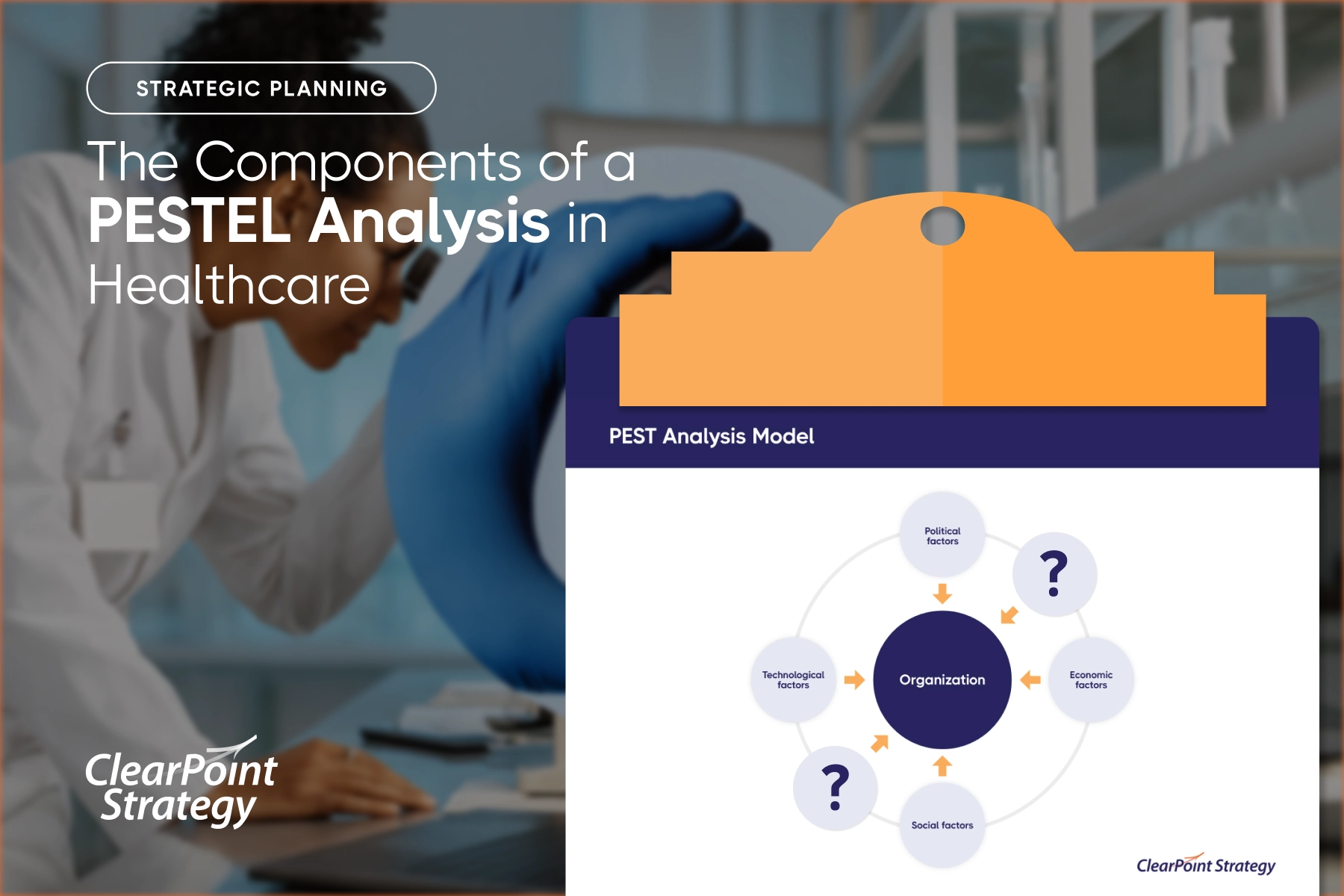
Healthcare KPIs
Healthcare KPIs track clinical quality, patient experience, and financial sustainability across a hospital or health system. They connect the safety and outcomes of care delivery to the operational and revenue metrics that keep the organization solvent.
↓ Go deeper: See 30 healthcare KPIs & metrics to track →
Hospital Readmission Rate (Lagging)
Definition: Share of discharged patients readmitted to a hospital within a defined window, typically 30 days. Formula: (Readmissions within 30 days ÷ total discharges) × 100. Example: 240 ÷ 3,000 = 8% readmission rate.
What good looks like: U.S. 30-day all-cause readmission runs ~14–15%, and CMS financially penalizes excess readmissions, so beating the national rate is the goal · Weak vs strong: "Reduce readmissions" → "Cut 30-day all-cause readmissions to under 10% for heart-failure patients by year-end, owned by the VP of Quality".
Average Length of Stay (ALOS) (Lagging)
Definition: Average number of days an admitted patient stays in the hospital per inpatient episode. Formula: Total inpatient days ÷ number of discharges (or admissions). Example: 12,600 patient days ÷ 3,000 discharges = 4.2 days ALOS.
Bed Occupancy Rate (Lagging)
Definition: Proportion of available inpatient beds occupied over a period, indicating capacity utilization. Formula: (Occupied bed days ÷ available bed days) × 100. Example: 25,500 ÷ 30,000 = 85% occupancy.
Patient Satisfaction (HCAHPS) (Lagging)
Definition: Standardized survey measuring patients' perspectives on their hospital care, often summarized as the share giving a top-box rating. Formula: (Top-box "9 or 10" overall ratings ÷ total survey respondents) × 100. Example: 1,440 ÷ 1,800 = 80% top-box score.
What good looks like: track the top-box (9–10) share against the national CMS percentile; the target is steady movement up the percentile, not a single fixed number · Weak vs strong: "Improve patient experience" → "Raise HCAHPS overall top-box rating to 82% across med-surg units by Q3, owned by the Chief Nursing Officer".
Hospital-Acquired Infection (HAI) Rate (Lagging)
Definition: Rate of infections patients contract during their hospital stay, normalized to patient exposure. Formula: (Number of HAIs ÷ patient days) × 1,000. Example: (45 ÷ 30,000) × 1,000 = 1.5 infections per 1,000 patient days.
Emergency Department Wait Time (Lagging)
Definition: Average time from a patient's ED arrival to being seen by a qualified clinical provider. Formula: Sum of door-to-provider times ÷ number of ED patients. Example: 50,000 minutes ÷ 2,000 patients = 25 min average.
Mortality Rate (Lagging)
Definition: Share of admitted patients who die during their hospital stay, often risk-adjusted for case mix. Formula: (In-hospital deaths ÷ total discharges) × 100. Example: 60 ÷ 3,000 = 2% mortality rate.
Medication Error Rate (Lagging)
Definition: Frequency of medication errors relative to the volume of doses administered. Formula: (Medication errors ÷ total doses administered) × 100. Example: 150 ÷ 50,000 = 0.3% error rate.
Claim Denial Rate (Lagging)
Definition: Percentage of submitted insurance claims denied by payers on first submission. Formula: (Denied claims ÷ total claims submitted) × 100. Example: 700 ÷ 10,000 = 7% denial rate.
Days in Accounts Receivable (Lagging)
Definition: Average number of days it takes to collect payment after a service is billed. Formula: (Total accounts receivable ÷ average daily net patient revenue). Example: $9M ÷ $200K per day = 45 days in A/R.
Patient No-Show Rate (Lagging)
Definition: Share of scheduled appointments where the patient fails to attend without canceling. Formula: (No-show appointments ÷ total scheduled appointments) × 100. Example: 800 ÷ 8,000 = 10% no-show rate.
Staff-to-Patient Ratio (Leading)
Definition: Number of clinical staff (e.g., nurses) available per patient, a leading indicator of care capacity and safety. Formula: Number of nurses on shift ÷ number of patients. Example: 25 nurses ÷ 100 patients = 1:4 ratio.
Operating Margin (Lagging)
Definition: Profitability of core operations as a share of total operating revenue. Formula: ((Operating revenue − operating expenses) ÷ operating revenue) × 100. Example: (($210M − $200M) ÷ $210M) × 100 = 4.8% margin.
Higher Education KPIs
Higher education KPIs gauge an institution's ability to attract, retain, and graduate students while sustaining its academic and financial health. They link the student-success funnel to the research and advancement metrics that fund the mission.
↓ Go deeper: See the full guide to KPIs in higher education →
Student Enrollment (Lagging)
Definition: Total count of students registered at the institution for a given term, typically reported as headcount or full-time equivalent. Formula: Sum of all registered students for the term. Example: 9,200 undergraduates + 2,800 graduates = 12,000 enrolled.
Student Retention Rate (Leading)
Definition: Share of first-year students who return to the same institution for their second year, an early signal of eventual graduation. Formula: (Students returning year two ÷ first-year cohort) × 100. Example: 2,550 ÷ 3,000 = 85% retention.
What good looks like: first-to-second-year retention averages ~75% at four-year institutions and swings widely by selectivity, so set the target against your peer group · Weak vs strong: "Keep more students" → "Lift first-to-second-year retention to 87% for the incoming cohort by next fall, owned by the VP of Student Success".
Graduation Rate (Lagging)
Definition: Share of an entering cohort that completes a degree within a defined period, commonly 150% of normal time (6 years for a 4-year degree). Formula: (Graduates within the window ÷ entering cohort) × 100. Example: 1,950 ÷ 3,000 = 65% 6-year graduation rate.
What good looks like: the federal 6-year graduation rate averages ~60–64% at four-year schools; compare to peer institutions rather than a universal bar · Weak vs strong: "Graduate more students" → "Raise the 6-year graduation rate to 68% for the 2020 entering cohort, owned by the Provost".
Student-to-Faculty Ratio (Lagging)
Definition: Number of students per full-time-equivalent instructional faculty member, a proxy for class size and access. Formula: FTE students ÷ FTE faculty. Example: 12,000 ÷ 800 = 15:1 ratio.
Cost Per Student (Lagging)
Definition: Total educational expenditure divided by enrollment, measuring the cost of delivering instruction per student. Formula: Total operating expenditure ÷ FTE students. Example: $240M ÷ 12,000 = $20,000 per student.
Job Placement Rate (Lagging)
Definition: Share of graduates employed or in further education within a set period after graduation, typically six months. Formula: (Graduates placed ÷ graduates seeking placement) × 100. Example: 1,700 ÷ 2,000 = 85% placement.
Time-to-Degree (Lagging)
Definition: Average elapsed time students take to complete their degree from initial enrollment. Formula: Sum of years to completion ÷ number of graduates. Example: 8,400 years ÷ 2,000 graduates = 4.2 years average.
Course Completion Rate (Leading)
Definition: Share of enrolled course seats that students complete with a passing grade, an early indicator of progression. Formula: (Courses completed successfully ÷ courses enrolled) × 100. Example: 46,000 ÷ 50,000 = 92% completion.
Research Funding Secured (Lagging)
Definition: Total value of external research grants and contracts awarded to the institution in a period. Formula: Sum of all awarded grant and contract dollars. Example: 180 awards totaling $45M secured.
Alumni Giving Rate (Lagging)
Definition: Share of solicitable alumni who make a financial gift to the institution in a given year. Formula: (Alumni donors ÷ total solicitable alumni) × 100. Example: 12,000 ÷ 100,000 = 12% giving rate.
Application Yield Rate (Leading)
Definition: Share of admitted students who choose to enroll, signaling enrollment strength ahead of the term. Formula: (Students who enroll ÷ students admitted) × 100. Example: 3,000 ÷ 7,500 = 40% yield.
Endowment Growth (Lagging)
Definition: Year-over-year percentage change in the market value of the institution's endowment. Formula: ((Ending value − beginning value) ÷ beginning value) × 100. Example: (($840M − $800M) ÷ $800M) × 100 = 5% growth.
Utilities & Energy KPIs
Utilities and energy KPIs measure the reliability, safety, efficiency, and regulatory standing of an organization that delivers electricity, water, or gas. They quantify how consistently customers receive service and how well the utility manages risk and resource loss.
System Average Interruption Duration Index (SAIDI) (Lagging)
Definition: Average total duration of outages experienced by a customer over a period, measured in minutes per customer per year. Formula: Sum of all customer interruption durations ÷ total number of customers served. Example: 9,000,000 customer-minutes ÷ 100,000 customers = 90 minutes per customer.
What good looks like: U.S. utilities average roughly 100–150 minutes of interruption per customer per year excluding major events (which are reported separately); lower is better · Weak vs strong: "Improve reliability" → "Cut SAIDI to under 90 minutes per customer this year (excluding major events), owned by the VP of Grid Operations".
System Average Interruption Frequency Index (SAIFI) (Lagging)
Definition: Average number of sustained interruptions a customer experiences over a period. Formula: Total number of customer interruptions ÷ total number of customers served. Example: 120,000 customer interruptions ÷ 100,000 customers = 1.2 interruptions per customer.
Customer Average Interruption Duration Index (CAIDI) (Lagging)
Definition: Average time to restore service per interruption, effectively SAIDI divided by SAIFI. Formula: SAIDI ÷ SAIFI (sum of interruption durations ÷ total number of interruptions). Example: 90 minutes ÷ 1.2 interruptions = 75 minutes per interruption.
Percent Renewable Generation (Lagging)
Definition: Share of total energy generated or delivered that comes from renewable sources. Formula: (Renewable generation ÷ total generation) × 100. Example: 1,200 GWh ÷ 4,000 GWh = 30% renewable.
Line Loss / Transmission Loss (Lagging)
Definition: Share of generated electricity lost during transmission and distribution before reaching customers. Formula: ((Energy generated − energy delivered) ÷ energy generated) × 100. Example: ((4,000 − 3,760) ÷ 4,000) × 100 = 6% line loss.
Customer Satisfaction (Lagging)
Definition: Customer-rated satisfaction with utility service, reliability, and support, captured via survey. Formula: (Satisfied respondents ÷ total respondents) × 100. Example: 4,200 ÷ 5,000 = 84% satisfaction.
Safety Incident Rate (OSHA Recordables) (Lagging)
Definition: OSHA-recordable injuries and illnesses normalized to 100 full-time workers per year (the Total Recordable Incident Rate). Formula: (Number of recordable incidents × 200,000) ÷ total hours worked. Example: (12 × 200,000) ÷ 1,000,000 = 2.4 TRIR.
What good looks like: a Total Recordable Incident Rate under ~3.0 is broadly considered good; the safest operations push toward zero · Weak vs strong: "Work safely" → "Hold the Total Recordable Incident Rate below 2.0 across field crews this year, owned by the Director of Health & Safety".
Capacity Factor (Lagging)
Definition: Ratio of actual energy output to the maximum possible output if a plant ran at full capacity the entire period. Formula: (Actual energy output ÷ (rated capacity × hours in period)) × 100. Example: (3,066 GWh ÷ 4,380 GWh) × 100 = 70% capacity factor.
Non-Revenue Water (Water Loss) (Lagging)
Definition: Share of water produced that is lost to leaks, theft, or metering errors before it is billed. Formula: ((Water supplied − water billed) ÷ water supplied) × 100. Example: ((10,000 − 8,500) ÷ 10,000) × 100 = 15% non-revenue water.
Regulatory Compliance Rate (Lagging)
Definition: Share of applicable regulatory requirements and reporting obligations met without violation in a period. Formula: (Requirements met ÷ total applicable requirements) × 100. Example: 245 ÷ 250 = 98% compliance.
Average Restoration Time (Lagging)
Definition: Average time taken to restore service to customers after an outage begins. Formula: Sum of restoration times ÷ number of outage events. Example: 4,500 minutes ÷ 60 outages = 75 min average.
Banking & Financial Services KPIs
Banks balance profitability, risk, and capital adequacy under heavy regulation, so their KPIs blend financial returns with liquidity and credit-quality measures. The leading indicators below warn of margin and risk pressure before lagging profitability results land.
↓ Go deeper: See 17 KPIs every bank should track →
Net Interest Margin (NIM) (Lagging)
Definition: The spread a bank earns between interest generated on assets and interest paid on funding, relative to its earning assets. Formula: (Interest income − interest expense) ÷ average earning assets. Example: ($120M − $45M) ÷ $2.5B = 3.0%. What good looks like: U.S. bank net interest margins typically sit around ~3%; the right target depends on asset mix and the rate environment · Weak vs strong: "Improve our margins" → "Lift NIM from 3.0% to 3.3% by Q4, owned by the Treasury lead through repricing the loan book".
Return on Assets (ROA) (Lagging)
Definition: How efficiently a bank converts its total assets into net profit. Formula: Net income ÷ average total assets. Example: $90M ÷ $7.5B = 1.2%.
Return on Equity (ROE) (Lagging)
Definition: The return generated on shareholders' invested capital. Formula: Net income ÷ average shareholders' equity. Example: $90M ÷ $750M = 12%.
Efficiency Ratio (Lagging)
Definition: The share of revenue consumed by operating expenses, where lower is better. Formula: Non-interest expense ÷ (net interest income + non-interest income). Example: $180M ÷ $300M = 60%. What good looks like: below 50% is excellent for a bank, 50–60% is solid, and above ~70% signals cost pressure (lower is better) · Weak vs strong: "Cut costs" → "Bring the efficiency ratio below 58% within two quarters, owned by the COO via branch consolidation".
Non-Performing Loan (NPL) Ratio (Lagging)
Definition: The proportion of the loan portfolio that is in or near default. Formula: Non-performing loans ÷ total gross loans. Example: $40M ÷ $2B = 2.0%.
Common Equity Tier 1 (CET1) Capital Ratio (Lagging)
Definition: A bank's core equity capital measured against its risk-weighted assets, the central regulatory solvency gauge. Formula: CET1 capital ÷ risk-weighted assets. Example: $600M ÷ $5B = 12%.
Loan-to-Deposit Ratio (Leading)
Definition: How much of a bank's deposits are lent out, signaling liquidity and lending appetite. Formula: Total loans ÷ total deposits. Example: $2B ÷ $2.5B = 80%.
Cost of Funds (Leading)
Definition: The average interest rate a bank pays to fund its assets through deposits and borrowings. Formula: Total interest expense ÷ average interest-bearing liabilities. Example: $45M ÷ $2.25B = 2.0%.
Deposit Growth Rate (Leading)
Definition: The pace at which a bank's deposit base is expanding over a period. Formula: (Ending deposits − beginning deposits) ÷ beginning deposits. Example: ($2.5B − $2.3B) ÷ $2.3B = 8.7%.
Non-Interest (Fee) Income Ratio (Lagging)
Definition: The share of total revenue coming from fees and services rather than lending spread. Formula: Non-interest income ÷ total revenue. Example: $90M ÷ $300M = 30%.
Customer Acquisition Cost (Leading)
Definition: The average marketing and onboarding cost to win one new banking customer. Formula: Total acquisition spend ÷ new customers acquired. Example: $3M ÷ 15,000 = $200.
Digital Adoption Rate (Leading)
Definition: The percentage of customers actively using digital banking channels. Formula: Active digital users ÷ total customers. Example: 480,000 ÷ 600,000 = 80%.
Manufacturing KPIs
Manufacturing KPIs center on turning equipment, materials, and labor into quality output with minimal waste and downtime. Leading indicators on the line drive the lagging cost and delivery outcomes that customers feel.
Overall Equipment Effectiveness (OEE) (Lagging)
Definition: A composite score of how fully manufacturing equipment is utilized, combining availability, performance, and quality. Formula: Availability × Performance × Quality. Example: 90% × 95% × 98% = 83.8%. What good looks like: 85% OEE is the textbook gold-standard mark; ~60% is typical for discrete manufacturers, and under 40% signals major hidden losses · Weak vs strong: "Run the lines better" → "Raise Line 3 OEE from 83% to 88% by year-end, owned by the plant manager via downtime root-cause fixes".
Scrap Rate (Lagging)
Definition: The share of produced material discarded as unusable waste. Formula: Scrapped units ÷ total units produced. Example: 600 ÷ 30,000 = 2.0%.
First Pass Yield (Lagging)
Definition: The percentage of units made correctly the first time without rework or scrap. Formula: Good units (no rework) ÷ total units started. Example: 28,500 ÷ 30,000 = 95%. What good looks like: the best lines approach 99%+ first pass yield; the gap to 100% is your hidden cost of poor quality · Weak vs strong: "Reduce defects" → "Lift first pass yield from 95% to 97% on the assembly cell within one quarter, owned by the quality engineer".
On-Time Delivery (Lagging)
Definition: The proportion of customer orders shipped by the promised date. Formula: Orders delivered on time ÷ total orders shipped. Example: 4,750 ÷ 5,000 = 95%.
Inventory Turns (Lagging)
Definition: How many times inventory is sold and replaced over a period, indicating working-capital efficiency. Formula: Cost of goods sold ÷ average inventory. Example: $48M ÷ $8M = 6.0 turns.
Unplanned Downtime (Leading)
Definition: The share of scheduled production time lost to unexpected equipment stoppages. Formula: Unplanned downtime hours ÷ scheduled production hours. Example: 60 ÷ 600 = 10%.
Throughput (Leading)
Definition: The volume of good units a process produces per unit of time. Formula: Total good units produced ÷ time period. Example: 24,000 units ÷ 20 hours = 1,200 units/hour.
Defects Per Million (PPM) (Lagging)
Definition: The number of defective parts expected per one million produced, a precision quality measure. Formula: (Defective units ÷ total units) × 1,000,000. Example: (15 ÷ 30,000) × 1,000,000 = 500 PPM.
Safety Incident Rate (Lagging)
Definition: The frequency of recordable workplace injuries normalized to hours worked (OSHA TRIR basis). Formula: (Recordable incidents × 200,000) ÷ total hours worked. Example: (5 × 200,000) ÷ 400,000 = 2.5.
Cost Per Unit (Lagging)
Definition: The fully loaded production cost to make one unit of output. Formula: Total production costs ÷ total units produced. Example: $1.5M ÷ 30,000 = $50.
Retail & E-commerce KPIs
Retail and e-commerce KPIs track how efficiently traffic and inventory convert into profitable sales across stores and digital channels. Leading signals like conversion and traffic predict the lagging revenue and margin results.
Conversion Rate (Leading)
Definition: The share of visitors or shoppers who complete a purchase. Formula: Transactions ÷ total visits (or visitors). Example: 4,000 ÷ 160,000 = 2.5%. What good looks like: e-commerce conversion typically runs 2–3%; well-optimized stores clear 4%+ · Weak vs strong: "Sell more online" → "Raise site conversion from 2.5% to 3.1% by Q3, owned by the ecommerce lead via checkout redesign".
Average Order Value (AOV) (Lagging)
Definition: The average revenue collected per order placed. Formula: Total revenue ÷ number of orders. Example: $340,000 ÷ 4,000 = $85. What good looks like: there is no universal number — grow it against your own baseline via bundling and free-ship thresholds, and always watch it alongside margin · Weak vs strong: "Get bigger baskets" → "Grow AOV from $85 to $95 within two quarters, owned by merchandising via bundles and free-ship thresholds".
Sales Per Square Foot (Lagging)
Definition: Revenue generated per unit of selling floor space, a core store-productivity measure. Formula: Net sales ÷ selling square footage. Example: $2.5M ÷ 5,000 = $500/sq ft.
Inventory Turnover (Lagging)
Definition: How many times stock is sold through and replenished over a period. Formula: Cost of goods sold ÷ average inventory. Example: $6M ÷ $1.2M = 5.0 turns.
Gross Margin Return on Investment (GMROI) (Lagging)
Definition: The gross margin earned for every dollar invested in inventory. Formula: Gross margin ÷ average inventory cost. Example: $3M ÷ $1.2M = $2.50.
Cart Abandonment Rate (Leading)
Definition: The share of shoppers who add items to a cart but leave without buying. Formula: 1 − (completed purchases ÷ carts created). Example: 1 − (4,000 ÷ 16,000) = 75%.
Same-Store (Comparable) Sales Growth (Lagging)
Definition: Revenue growth from stores open at least a year, stripping out new-location effects. Formula: (Current-period comp sales − prior-period comp sales) ÷ prior-period comp sales. Example: ($10.5M − $10M) ÷ $10M = 5%.
Return Rate (Lagging)
Definition: The proportion of sold items that customers send back. Formula: Units returned ÷ units sold. Example: 400 ÷ 4,000 = 10%.
Customer Lifetime Value (CLV) (Lagging)
Definition: The total gross profit expected from a customer across their entire relationship. Formula: Average order value × purchase frequency × customer lifespan × gross margin. Example: $85 × 4 orders/yr × 3 yrs × 50% = $510.
Foot Traffic / Sessions (Leading)
Definition: The count of in-store visitors or online sessions reaching the channel, the top of the sales funnel. Formula: Total store visits or website sessions in a period. Example: 160,000 sessions in a month.
SaaS KPIs
SaaS KPIs measure recurring-revenue health, retention, and the economics of acquiring and keeping customers. Leading product and acquisition signals predict the lagging revenue and churn outcomes that determine growth efficiency.
Monthly Recurring Revenue (MRR) (Lagging)
Definition: The predictable subscription revenue normalized to a monthly amount. Formula: Sum of all active monthly subscription fees (annual plans ÷ 12). Example: 1,000 customers × $200/mo = $200,000 MRR.
Annual Recurring Revenue (ARR) (Lagging)
Definition: The annualized value of recurring subscription revenue. Formula: MRR × 12. Example: $200,000 × 12 = $2.4M ARR.
Customer Churn Rate (Lagging)
Definition: The share of customers who cancel within a period. Formula: Customers lost in period ÷ customers at start of period. Example: 20 ÷ 1,000 = 2% monthly.
Net Revenue Retention (NRR) (Lagging)
Definition: Revenue retained from existing customers including expansion, net of downgrades and churn. Formula: (Starting MRR + expansion − contraction − churn) ÷ starting MRR. Example: ($200K + $30K − $8K − $12K) ÷ $200K = 105%. What good looks like: 100% NRR means expansion fully offsets churn; the strongest SaaS companies sustain 120%+, the single strongest growth signal · Weak vs strong: "Keep customers happy" → "Lift NRR from 105% to 115% this fiscal year, owned by the Head of CS via an expansion playbook".
Customer Acquisition Cost (CAC) (Leading)
Definition: The fully loaded sales and marketing cost to acquire one new customer. Formula: Total sales & marketing spend ÷ new customers acquired. Example: $600,000 ÷ 100 = $6,000.
Customer Lifetime Value (LTV) (Lagging)
Definition: The total gross profit a customer generates over their entire subscription life. Formula: (Average revenue per account × gross margin) ÷ churn rate. Example: ($2,400/yr × 80%) ÷ 0.20 = $9,600.
CAC Payback Period (Leading)
Definition: The number of months of gross profit needed to recover the cost of acquiring a customer. Formula: CAC ÷ (monthly revenue per customer × gross margin). Example: $6,000 ÷ ($200 × 80%) = 37.5 months. What good looks like: under 12 months is healthy for most SaaS; under ~6 months is exceptional · Weak vs strong: "Make acquisition pay off faster" → "Cut CAC payback from 37 months to under 18 months by Q4, owned by the CMO via channel mix shift".
Activation Rate (Leading)
Definition: The share of new users who reach a defined first-value milestone. Formula: Users reaching activation event ÷ total new signups. Example: 650 ÷ 1,000 = 65%.
DAU/MAU Ratio (Leading)
Definition: A stickiness measure comparing daily to monthly active users. Formula: Daily active users ÷ monthly active users. Example: 12,000 ÷ 40,000 = 30%.
Gross Margin (Lagging)
Definition: The share of revenue left after the direct cost of delivering the software service. Formula: (Revenue − cost of revenue) ÷ revenue. Example: ($2.4M − $480K) ÷ $2.4M = 80%.
Nonprofit KPIs
Nonprofit KPIs measure both financial stewardship and mission impact, proving to donors and boards that dollars convert into outcomes. Leading indicators on fundraising and retention drive the lagging efficiency and impact results.
Program Efficiency Ratio (Lagging)
Definition: The share of total spending that goes directly to programs rather than overhead. Formula: Program expenses ÷ total expenses. Example: $850,000 ÷ $1,000,000 = 85%. What good looks like: charity evaluators often look for ~65–75%+ of spend going to programs, though context matters and an extreme ratio can mean starved infrastructure · Weak vs strong: "Spend more on the mission" → "Raise program efficiency from 85% to 88% this fiscal year, owned by the Finance Director via overhead reduction".
Fundraising ROI (Lagging)
Definition: The dollars raised for every dollar invested in fundraising. Formula: Funds raised ÷ fundraising expenses. Example: $1.2M ÷ $300,000 = $4.00.
Donor Retention Rate (Lagging)
Definition: The share of prior-period donors who give again in the current period. Formula: Returning donors ÷ total donors from prior period. Example: 2,700 ÷ 6,000 = 45%. What good looks like: average donor retention hovers around ~45%, and first-time-donor retention is far lower (~20–25%), so even small gains compound fundraising dramatically · Weak vs strong: "Keep donors giving" → "Lift donor retention from 45% to 55% within one year, owned by the Development Manager via a stewardship program".
Cost Per Dollar Raised (Lagging)
Definition: The expense incurred to raise each dollar of contributions, the inverse of fundraising ROI. Formula: Fundraising expenses ÷ funds raised. Example: $300,000 ÷ $1.2M = $0.25.
Program Outcome Achievement (Lagging)
Definition: The degree to which programs hit their stated impact targets. Formula: Outcomes achieved ÷ outcomes targeted. Example: 900 ÷ 1,000 people served = 90%.
Volunteer Retention Rate (Leading)
Definition: The share of volunteers who continue serving from one period to the next. Formula: Returning volunteers ÷ total volunteers from prior period. Example: 480 ÷ 600 = 80%.
Administrative Cost Ratio (Lagging)
Definition: The portion of spending consumed by management and general administration. Formula: Administrative expenses ÷ total expenses. Example: $100,000 ÷ $1,000,000 = 10%.
Grant Success Rate (Leading)
Definition: The share of submitted grant applications that are awarded funding. Formula: Grants awarded ÷ grant applications submitted. Example: 12 ÷ 40 = 30%.
What 20,500+ strategic plans reveal about the KPIs that work
You can find KPI examples anywhere. What you cannot find anywhere else is what happens to them after someone picks them. We can see that part. Across more than 20,500 strategic plans and 500+ organizations on the ClearPoint platform, the same three patterns repeat. They explain why most scorecards quietly die — and what the survivors do differently.
Most KPIs are nobody's job
Sixty-seven percent of the KPIs we see have no owner. Not a vague owner. None. For strategic objectives it is worse: 77.6% have nobody attached. A KPI with no name beside it is a KPI nobody updates, and the data backs that up. The pattern holds across every sector, but some are starker than others.
Ownership is not paperwork. It is the single strongest predictor of whether anything gets done. Projects with a named owner are completed about 2.5 times as often as projects without one.
“In thirty years of helping organizations execute strategy, I have never seen a KPI fail because the formula was wrong. They fail because no one owns them. Pick fewer measures, put a name beside each one, and review them like you mean it. That is the whole game.”
— Ted Jackson, Co-Founder, ClearPoint Strategy
Very few projects ever finish
Picking the right KPI is step one. Closing the work behind it is the part that breaks. Platform-wide, only about 14% of initiatives are ever completed — roughly one in seven. The rate swings hard by sector, and the pattern is humbling for the industries that track the most.
The KPIs almost everyone tracks
Strip out the system roll-ups and a clear pattern emerges in what organizations actually put on their scorecards. It leans hard toward money, safety, and people.
- Revenue — tracked by 185 organizations
- Expenses — 174
- Costs — 114
- Budget surplus — 97
- Average employee wage — 90
- EMS / emergency response time — 90
- Employee satisfaction — 84
- Average response time, priority-one calls — 82
- Net profit — 80
- Overhead costs — 77
Useful, but notice what is missing: almost nothing that looks ahead. The most-tracked KPIs are nearly all lagging. That is the quiet reason so many scorecards feel like rear-view mirrors.
The scorecards that work track less
Put the three patterns together and the lesson writes itself. The organizations that finish things do not track more KPIs. They track fewer, they put a name beside each one, and they review them on a cadence. More measures do not mean more progress. Usually they mean more places to hide.
How to choose your KPIs
You now have 200-plus examples and the data on what happens to them. Here is how to turn that into a short list you will actually run.
Pick few. A team can steer by five to nine KPIs. Beyond that, attention thins and the dashboard becomes wallpaper. If a measure would not change a decision, it is a metric, not a KPI. Leave it off. (More on the right number of KPIs to track.)
Pair leading with lagging. For every result you care about, add one early signal you can act on before the result lands. Revenue pairs with pipeline coverage. Graduation rate pairs with first-year retention. Outage minutes pair with maintenance completed. (See how to set leading indicators.)
Give every KPI one owner. Not a team. A person, by name. This is the move our data says matters most — owned work finishes 2.5× as often. If you cannot name an owner, you are not ready to track it.
Avoid the four traps. The ghost owner — a KPI assigned to everyone, owned by no one. The vanity metric — a number that always goes up and never forces a decision. The unsegmented average — a citywide or company-wide mean that hides the segment that is failing. And the gamed target — a number people hit by bending behavior, like closing tickets fast by closing them unresolved. Name the owner, segment the data, and tie the KPI to a goal, and all four mostly disappear.
How to build and track your KPIs
Once you have your short list, these guides take you the rest of the way — from writing the measure to watching it move.
- Set up and measure them: how to set up, measure, and track your KPIs
- Set targets: How to set KPI targets in 9 steps
- Report on them: What is a KPI report, and how do you create one
- Show status at a glance: How to establish RAG statuses for KPIs
- Build a dashboard: KPI dashboards in Excel · KPI dashboard best practices
- KPIs vs OKRs: OKRs vs KPIs — how they differ and when to use each
When a spreadsheet stops keeping up, that is what ClearPoint's KPI software and strategy execution platform are built for: one owner per measure, automatic status, and reports that build themselves.
KPI examples — frequently asked questions
What is a KPI?
A key performance indicator (KPI) is a quantifiable measure of progress toward a specific goal. It tells you whether you are on track to hit a target you have chosen to steer by. A KPI is always a metric, but most metrics are not KPIs — only the few tied to a goal earn the name.
What is a good KPI example?
A good KPI example has five parts: a clear name, a formula you can compute, a target, a review cadence, and one named owner. "Cut 30-day hospital readmissions from 12% to 9% by year-end, owned by the VP of Quality" is a good KPI. "Improve patient care" is not — it has no number, no target, and no owner.
How many KPIs should you track?
Most teams should steer by five to nine KPIs. Past that, attention spreads thin and the scorecard stops driving decisions. Our platform data is blunt on this: tracking more measures does not correlate with finishing more work. Fewer, owned KPIs beat long, unowned lists.
What is the difference between a KPI and a metric?
A metric is anything you can measure. A KPI is a metric you have chosen to manage by, because it ties directly to a goal. Page views are a metric. "Organic signups per month, target 500" is a KPI. Every KPI is a metric; very few metrics deserve to be KPIs.
What are leading and lagging KPIs?
A lagging KPI measures a result that already happened — revenue, churn, graduation rate. A leading KPI measures an early signal that predicts the result — pipeline coverage, response time, training hours. Lagging KPIs are easier to trust; leading KPIs are easier to act on. Strong scorecards pair them.
What are the best KPIs for local government?
The most common and useful local-government KPIs include emergency and EMS response time, 311 service-request resolution rate, road and pavement condition, permit processing time, budget variance, and citizen satisfaction. See the full library of 143 local government KPIs.
What are the best KPIs for healthcare?
Core healthcare KPIs include 30-day readmission rate, average length of stay, HCAHPS patient satisfaction, hospital-acquired infection rate, ED wait time, and claim denial rate. One caution from our data: 73.6% of healthcare KPIs we see have no owner, and only about 5% of healthcare projects ever finish. Assigning owners matters more here than almost anywhere.
Why do most KPIs fail?
Not because of the framework. They fail because no one owns them. Two-thirds of the KPIs on our platform have no assigned owner, and unowned work is far less likely to ever get done. A KPI without a name beside it is a number nobody updates.
How often should you review KPIs?
Match the cadence to how fast the number moves. Operational KPIs — response time, ticket backlog, uptime — deserve a weekly look. Strategic KPIs — retention, margin, completion rate — fit a monthly or quarterly review. The rule that matters: set a fixed cadence and keep it. KPIs reviewed on a schedule stay alive; the rest go stale.
What is the difference between KPIs and OKRs?
KPIs measure the ongoing health of what you already do. OKRs (Objectives and Key Results) set a stretch goal for what you want to change next. KPIs tell you if the engine is running; OKRs tell you where you are trying to drive. Most teams use both. We break it down in OKRs vs KPIs.
Get the full KPI library
Want the examples above as a working file, plus the benchmarks behind them? Our 2026 Strategic Planning Report pulls together the platform data on what high performers actually track — and what they have learned to stop tracking.
And when your KPIs outgrow the spreadsheet, see how ClearPoint puts one owner on every measure, flags the ones drifting red, and turns your scorecard into the report your board has been asking for.
A KPI is not a number on a dashboard. It is a promise about what you will pay attention to. The hard part was never the list. It is choosing the few you will keep — and putting a name beside each one.
References & sources
Benchmarks and definitions in this guide draw on the sources below. Platform figures come from ClearPoint's proprietary strategy-execution data; benchmark ranges come from the standards bodies that govern each metric.
- ClearPoint platform data — proprietary analysis of 20,500+ strategic plans across 500+ organizations (KPI ownership, completion, and tracking patterns).
- Kaplan, R. & Norton, D., The Balanced Scorecard (Harvard Business Review) — leading vs lagging indicators.
- NFPA 1710 — fire and EMS response-time standards.
- U.S. Centers for Medicare & Medicaid Services (CMS) — Hospital Readmissions Reduction Program and the HCAHPS patient-experience survey.
- U.S. Department of Education / NCES — college retention and six-year graduation-rate benchmarks.
- IEEE 1366 — electric-utility reliability indices (SAIDI, SAIFI, CAIDI).
- U.S. OSHA — Total Recordable Incident Rate (TRIR) methodology.
- Government Finance Officers Association (GFOA) — local-government budgeting and financial-reporting best practices.